IMG_2075 (1)

Colorful Earrings…

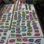
If you have ever watched me work in my studio or heard me talk about my preference for “Make more than One” – then you already know that I believe that there is a great opportunity to explore a design by making more than one version… occasionally, I do go overboard. This spring I made twenty four Skinner blend canes and set out to make a series of three earring designs including my curve earrings, glow earrings and glow earrings with leaves and petals.

Gratefully, when I went to put these new earrings together I had lots of help= folding earring cards, making holes in the cards, bending niobium ear wires, and inserting the wire guards. Thank you Jacqueline Cherie, Leslie Blackford, Judy Belcher and Ellen Prophater. In the end, another realization, I am NOT too good about estimating production and ended up with over 250 pairs of earrings.
IMG_2075 (1)

Colorful Cocktails…

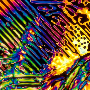
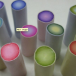
I love the subtle colors found in exquisite wines and champagnes- as one can almost already guess at the delights of the senses to follow. There are dozens of colorful cocktails ranging from the Tequila Sunrise to Pismo Sour. Usually one doesn’t examine cocktails under a microscope- Research scientist Michael Davis, Florida State University, crystallizes the cocktails on a lab slide, then photographs them using a camera attached to a light microscope.

At Bevshots, one can buy posters and coasters of these intriguingly colorful images, pictured here is a German Pilsner. There is an online quiz you can take here to explore your intuition in regards to the crystalized images of your favorite cocktails here. Note: the wine pairing question is a little tricky = don’t get inventive, Pinot Noirs, Champagnes and dry Rose would also be great pairings. Continue reading “Colorful Cocktails…”

IMG_2075 (1)

Colorful Van Gogh…

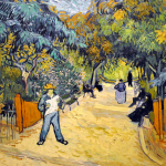
Living int the Washington, DC area has many advantages…including several Vincent Van Gogh paintings on exhibit for up close enjoyment. One of my most memorable “I can’t believe I just did that!” moments was when I was viewing one of his paintings at the Phillip’s Collection. I became so entranced by how little flicks of paint so perfectly came to resemble bunches of olive leaves that I reached out and touched the painting. Fully expecting to be escorted  out of the museum by several guards, I was surprised that no one seemed to notice. (I’m sure they have updated their security in regards to touching priceless paintings in the ensuing years).

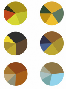
It is always interesting to see an artist’s colors schemes interpreted in new ways and Arthur Buxton’s Van Gogh pic charts do so while being aesthetically pleasing. You can read more about the charts here  on Flavorwire. Buxton will be posting a key = which painting corresponds to which pie chart in the future. In the meantime, which pie chart represents the color scheme in your favorite Van Gogh painting?

IMG_2075 (1)

Exploring the Enlightened Rainbow…

I am delighted to be returning to Maureen Carlson’s  Center for the Arts in Jordan Minnesota for a five day intensive workshop June 15th- 19th, 2011.

Exploring the Enlightened Rainbow: Embracing meditation, intuition and intention to design your color stories

Walking our artistic paths with wisdom and awareness is a sacred gift. While making a personal mediation walking stick you will explore the expressive and transformative gifts of color.

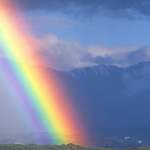
The seven colors of the chakra based energy system each reflect a different aspect of your being and life. For example, the root chakra is associated with the color red, and processes energies associated with grounding, your tribe and familial relationships.

Using guided meditations, intuitive collage exercises and intentional word association statements you will be exploring each of the seven major chakras, along with their specific gifts, as you build your power stick from the ground up. Continue reading “Exploring the Enlightened Rainbow…”

IMG_2075 (1)

Colorful Inspiration…

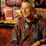
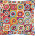
As artists most of us have “go to” books and artists where we look to for color inspiration. Kaffe Fassett is one of my favorites for color and pattern. I have six of his books, my favorite is Glorious color.

Several of his fabrics play important rolls in my patchwork living room curtains and over the years I have made several color inspiration collages based on clippings from an old Kaffe  Fassett calendar and photo copies of fabric swatches.

After reading his mosaic book- I made a colorful side table. So, I am thrilled that he has a new book out – “Simple Shapes Spectacular Quilts”. There is an interesting video interview here where he starts by saying “What interests me more than anything in the world is pattern”.

I wonder just what he would do if he experimented with polymer? For more inspiration visit his student’s Flickr pool.

Continue reading “Colorful Inspiration…”

IMG_2075 (1)

Colorful Paint Sound Sculptures..

Libby Mills sent me this colorful link to Design Bloom where you can see these wonderful sound sculptures.

“the creative Studio Dentsu, teamed up with photographer Linden Gledhill to create this series of paint sculptures using sound vibrations. the series was part of a campaign for Canon’s Pixma ink printer brand. the photographs and videos begin by wrapping a membrane around a small speaker. ink drops were placed on this membrane and the speaker was turned on. once it began to vibrate the ink begins to jump up and down. high-speed video cameras and still cameras were used to capture this including circling around the sculptures to see them from all angles. experimenting with different sounds and frequencies created the various pieces.”

Wishing you a colorful weekend and smooth transition to non-daylight savings time. I’m off to teach a color workshop in Dallas, Texas.

IMG_2075 (1)

Colorful Rhubarb Red…

I’ve been reading about the new red celery with fascination – (not really red to me, more like the “red” of red onions) …somewhat surprised to have landed on a site that explains “value added produce” (while following the  link trail) which is  something apparently that I buy often .

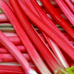
I am dreaming of rhubarb as I embark on making a new series of folded petal necklaces.

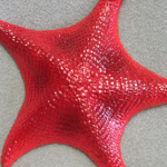
Colorscape- an Around the World Guide to Color by Naomi Kuno and the Color Intelligence Institute calls this red “Starfish”

  • Tropical
  • Floral
  • Gaudy
  • Charming
  • Alluring

CO/M98/Y75/K0

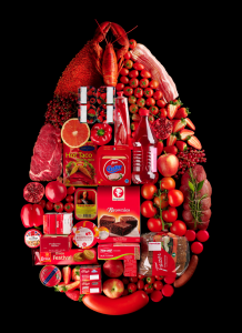
I drew color inspiration from food stylist Linda Lundgren’s food arranged by color series.

To mix my variation of this color I used one part Premo Cadmium red and one part Premo Fluorescent Pink. The resulting red is vibrant and makes for an edible looking cane which I look forward to fashioning into part of my new series of necklaces.

Next time you set out to mix a vibrant color in polymer clay  consider using either a fluorescent yellow or pink to pump-up your mixes.

IMG_2075 (1)

Colorful Teaching…

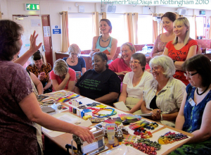
I love teaching– especially polymer clay workshops that allow the students  to come to a new understanding of color = how relax into approaching color with intuition; mix new colors, design palettes and learn new strategies for combining colors successfully. Above  is a picture of me teaching this past summer at  Polymer Play Days (sponsored by Helen Cox) In Nottingham, England.

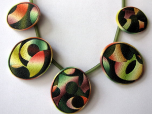
It is especially wonderful to see a student take inspiration from a class to make  a wonderful personalized variation on a technique via a finished piece.Here is a necklace from Ghost Shift/Sue Corrie.

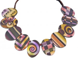
After teaching Textile Inspirations in Albequeque last month, Janet Paul sent me a picture of a delightful sampler necklace she made.